Friday, February 18, 2022

Orange You Glad It's Time? (Color Theory)

Orange is a fun but strong and energetic color. Interestingly enough, people feel strongly about using it (or not) in home decor.  Orange increases energy and boosts creativity so maybe we should be more open to it!

An inherently happy and uplifting color, orange is a hue that should be used more often in home decor. A shade that can be both contemporary and rustic, orange has a reputation for being a difficult color to decorate with, but that doesn't have to be the case. via TheSpruce.com

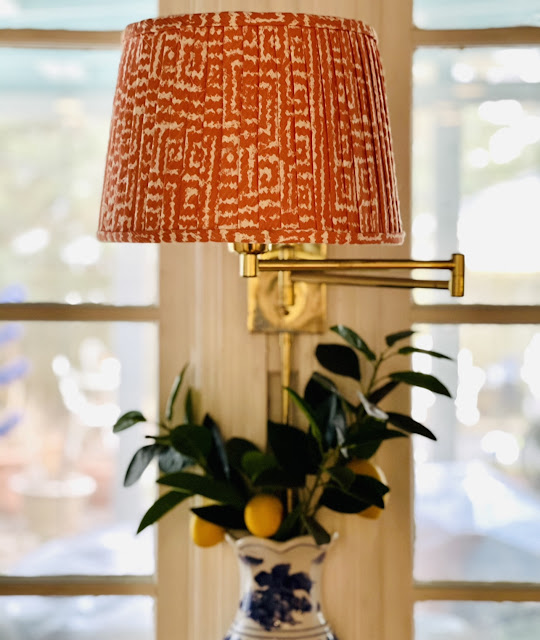
This chinoiserie lamp has a fun, bright orange background and it adds a pop of color to our garden room. 

I have another fabulous chinoiserie lamp in orange that is in our upstairs bathroom. I found this one in a thrift shop and love the touch of color it brings to the room. I've never found another orange and white one while out vintage shopping.


And long before the zebra rug made an appearance in our library there was a bright orange rug in there! You can see a little bit of it in the (poor quality) shot below.

But truth be told, at our house, the "orange" items tend to skew coral which is one of my favorite colors of all time. It's warm and easy to use with every other color. Not pink and not orange, coral is a blend of both and that makes it a win in my book.


I painted this faux bamboo cabinet a gorgeous, glossy coral. Our main bathroom is closet-less so I found this china cabinet to use as creative storage. It's amazing how much this bold color changed the cabinet! This was the listing picture in the thrifting app.


I have a second faux bamboo piece painted in the same cheery coral. This one is in our kitchen and you can see I even use coral-y orange plaid bows in here at Christmas time. The curtains in the kitchen are a coral and orange leopard print. 


I used a coral-y orange fabric to create this faux pleated lampshade for our kitchen. The directions are here and it was even featured on Apartment Therapy (which was a thrill for me!) 


The orange color is nice during the day but it absolutely glows at night when the lamp is on. 


Not ready to fully commit to orange or even coral? I have a coral throw and a couple of shades of orange-y coral pillows that I add to the family room couch to cozy things up in the winter. They pick up the color in the shells in the cabinet behind them which is a bonus.


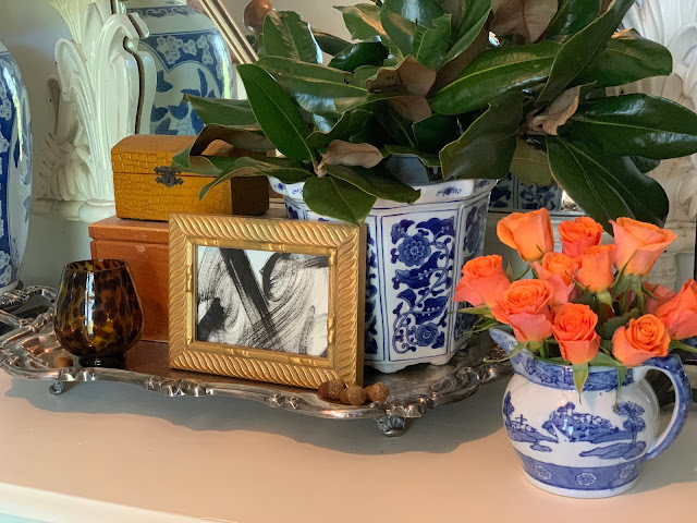
My monkey often holds a pile of oranges - real fruit is a great way to add color (and you can snack on it, too!) and I often buy orange and bright coral roses because they add such a fresh spot of color. They are a great addition during the winter. 


I have this great piece of Jane Shelton faux bois fabric in a coral and orange stripe. I'm not sure where I am going to use it but I love the colors and anything faux bois so I had to grab a few yards for future use.


I have used orange pillows on my porch from time to time. Orange looks great with all the blue on my porch because they are complementary colors on the color wheel. 


Last Summer we used coral and orange accents to accessorize our trough pool that we fondly call "the Bucket."


I found this great orange paisley on a soft blue background when I was fabric shopping last week. Pillows in this fun print would be fabulous on a Summer porch! It was such a beautiful combination of bright orange and soft blue, cool and warm colors and that large swirling paisley to top it all off. I love a good paisley!


Orange can be a great addition to your spaces - even if it's just a few flowers, some fruit or a pillow. The warmth and vibrancy adds a little something extra to a room and is much easier to incorporate than it initially seems. Orange is associated with success and confidence. And bravery. Be brave and try a touch (or more) of orange in your decor!


Wednesday, February 2, 2022

Hello Yellow! (Color Theory)

Yellow might be the most underused and underappreciated color in interior design. It is often considered the brightest and most energizing of the warm colors. It’s associated with happiness and sunshine. It can make a dark space more cheerful and it is the color associated  with hope and optimism. Sounds good to me!!


Light yellows also give a more calm feeling of happiness than bright yellows.


Dark yellows and gold-hued yellows can sometimes look antique and be used in rooms with a more traditional use or look. 

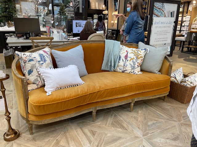
(If I was going to fall in love with a very expensive couch that is totally impractical for the way we live, then this ONE from Ballard would be IT!!!!! I saw it from across the showroom and it was love at first sight :)))  But doesn't that warm golden velvet just welcome you in? I think this color is so appealing!)

You can see that I'm drawn to this warm, mustardy yellow. I used this velvet ribbon at Christmas and it looked great with everything!


It's also the background color of my favorite tiger print pillow.


We have my favorite "yellow", a soft gold, from Sherwin Williams called Anjou Pear in our downstairs Powder Room and I used the same paint to paint a gingham rug on the screened porch. But If you aren't sure you are ready to commit to yellow in such a permanent  way then little touches will cheer things up too!


Try flowers or a bowl of lemons to add a dash of yellow. You can use the lemons so that's a bonus!


Or you can toss one golden yellow velvet pillow in a side chair.


I thrifted these yellow glazed jars and they look great filled with greenery and tucked in different spots around the house. Since they were thrifted it's not a big commitment or investment.


“There’s no doubt about it—yellow is a color that lifts one's spirits,” 
says designer Bunny Williams.

Go big or go small with yellow but add a touch to your home because who doesn't want to have their spirits lifted when they arrive home?

Be sure to read all the other Color Theory posts!
Feeling Green here.


Thursday, January 27, 2022

Feeling Green (Color Theory)

I have always been intrigued by the psychology of colors. Especially their impact on how they make us feel when they are used in our environment. I had quite a few college classes dealing with this - both when psychology was my minor, in art classes when I changed my major to textile design and then in a marketing/advertising focused class or two when I was a journalism major. Perhaps I should have taken a class on committing to a major. No need, my dad handled it by letting me know it was time to wrap things up as my life as a college student was coming to an end. Or at least the parental funding was!!

It all worked out but I still think about color psychology often, especially at the beginning of the year when paint companies and designers make their color trend forecasts or when I'm about to start a project at my home. So, I thought that perhaps this intrigues you as well and maybe we'd all like to know more about why we are drawn to certain colors. 

I could have gone in ROY G BIV or rainbow order but I keep seeing the statement "Green is having a moment this year" or people stating that they are really drawn to green lately. So I'm starting with green. I love green, I use it a lot and I think green as a color is great but an even better addition to a room is a green living element - plant, flowers, branches. 

Green is the color of nature. It is considered calming - it is actually shown to slow human metabolism and the result is a calming effect. Many feel that green reduces stress. So now that we know it's calming, reduces stress and connects us with the outside is it any wonder that we are seeing green everywhere right now?? If ever we needed these three benefits from a color it is NOW!

Over the past few months, four major paint brands announced that some type of green would be its color of the year for 2022. Behr went with a light sea-glass green called Breezeway; PPG Paints chose a neutral gray-green called Olive Sprig; Benjamin Moore picked a soft sage green called October Mist; and Glidden chose a creamy plant-inspired green called Guacamole. It’s no coincidence that the names and descriptions of all these shades hint at something natural or organic. According to environmental psychologist Sally Augustin, PhD, principal at Design With Science, this influx of green likely stems from our deep-rooted connection to nature and its supportive qualities. via wellandgood.com

These are some "green scenes" from my own home. I use a lot of green - painted and live. I almost think of green as a neutral in many of my spaces. 


Do you use green in your home? Are you thinking that it might be time to add some green to your spaces. Do you like plants? 

I love plants and I have a theory about having them in our homes. I hear people say that they don't have live plants in their rooms because they don't have a green thumb and they die. Well, when you buy a $10.00 floral bouquet at the grocery store you have zero expectations of it lasting more than a week. Even if you don't have much of a green thumb a $15 plant is going to last a month or two at least. And some of them might surprise you and do better than you think. I have a pretty green thumb but I do lose plants from time to time. And some do better than expected. They add so much to your space - take the risk!


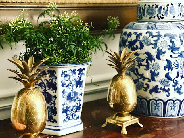
This $8.00 Jasmine from Trader Joe's has doubled in size in 2 weeks and is about to burst into blooms. I just make sure it is not completely dried out and has good light. It has surprised me!
And the topiaries (first picture) on my green bamboo table on the porch? I call them "faux-piaries" because they are all fake - pretty good looking ones and they add a nice touch of green to a room. 

Here is a favorite green from Sherwin Wiliams: Talipot Palm . It's about to show up on a small project at my house.


And our porch floor is Lounge Green. I get asked all the time!

Not sure about the power of green paint. Look at this before and after!


Go green! That's my advice :)


Monday, January 17, 2022

BOGO Roses!!

 BOGO Roses at Publix are my favorite thing that happens in January.

 I hope that you live near a Publix or another grocery that does this. It helps January a lot!


This pretty much sums it up for me:


I also love to buy what Trader Joe's calls "spray roses" because a $5.00 bunch will give me three small arrangements to put around the house. I'm not much of a flower "arranger" but I've found that simply cutting off all of the stems to approximately the same length and putting them in a small container results in a cute display.


I know that fresh flowers aren't always in the budget but, if you can, 
every once in a while Buy The Roses!


Here's to warmer, brighter days ahead.


Monday, January 10, 2022

January!! How Did That Happen??

 My previous post was titled "December!! How Did That Happen?" and before I could post another thing we are 10 days in to a new year. How DID that happen??

I don't have any resolutions to post. I don't have a word of the year. I am starting to think a little bit about a project or two but really, honestly, there isn't much going on around here. You are probably thinking "then why is she even putting a blog post up right now?" I've had that same thought ;)

We have been admiring Cooper's ability to ease very, very slowly in to the new year!


He is basically a professional!


I haven't been much more energetic either.

It's cold in the South (20's at night and we aren't very tough when it comes to the 20's!!) 

I'm channeling Cooper and being lazy and wearing thick wool socks. Mollie and I are hooked on these socks from Target!! They are the only thing keeping my perpetually cold feet happy right now. 

Another thing I wanted to share is the link for one of my zebra rugs. I have been answering the "where do you find your zebra rugs?" question on my Instagram pretty often lately.

The zebra rug in the Library (foreground) is one of my all time most amazing thrifting finds. The whole story is here. It is an Ethan Allen wool rug that is amazing quality and huge.


The zebra rug in my entry way is an Amazon find and available at a great price. 


I have it in the gray colorway but I've always been tempted to buy it in the black and white version as well! For those of you thinking I have two many zebra rugs - you may be right!!

In addition to  snoozing with Coop and answering DM's about zebra rugs I have been doing a deep dive into this Instagram account. Lots of inspiration!

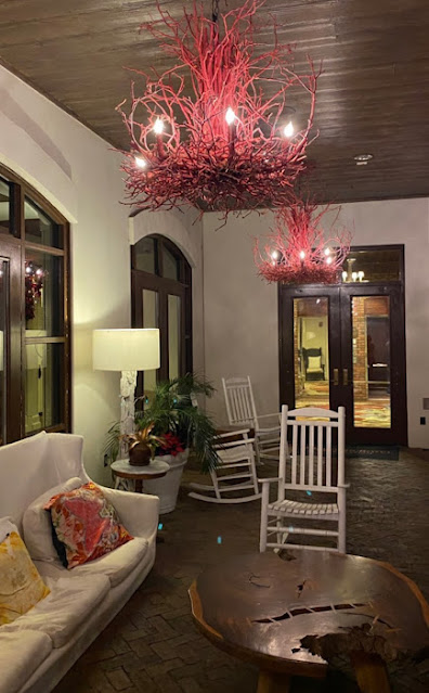
And I've been trying to figure out how to make and where to put a chandelier like this one. Once I saw this image I was hooked. They are in a boutique hotel in Orlando - all the info I have. I'm thinking sticks and coral-y red paint would be a good starting point. Where, oh, where could I hang one??


That's truly all I've got for now. Hoping for more motivation soon. 
And warm sunny weather!! That motivates me :)