Showing posts with label Sherwin Williams. Show all posts

Wednesday, September 24, 2025

Chinoiserie Style Painted Cabinet DIY

I have been hoping to find a beautiful chinoiserie style armoire on a thrifting trip. I originally hoped to find a black one and after looking for years it became clear that finding a big, beautiful lacquered armoire was a difficult ask for a thrift find. I have looked at several along the way that were generally pretty expensive and I also realized they might not be sturdy enough to hold the things that I needed to store. 

This white cabinet came from a big box store decades ago and stores my art and craft supplies. Collectively they are heavy. This cabinet is also deep which is a bonus. It was originally in the basement but when I morphed the room upstairs into the "Garden Room," as I call it, I brought it upstairs which was much more convenient. I knew it wasn't attractive and the search for the chinoiserie armoire began. No luck on that front. I had considered a couple of options to make it look better while looking for the elusive armoire but nothing really grabbed me. 

(Here it was - big and white!)

Reality set in - 1. I don't think any of the traditional chinoiserie cabinets will be large enough or strong enough. 2. Even if I find one they are thousands of dollars and I'm not willing to spend that. 3. I will keep looking but I cannot look at that big white box anymore. 

I popped on to Pinterest and started looking at antique and vintage chinoiserie cabinets with the thought of doing something to the cabinet to improve it. The first thing that happened is that a lot of beautiful green chinoiserie cabinets popped up and I became obsessed with the idea of doing something green. After all, there are green velvet curtains in the room already along with other green touches to perpetuate the "Garden Room" feel. See my inspiration board here.

The second thing that happened is that I realized that some of the pretty chinoiserie cabinets were made by American furniture companies like Thomasville and Baker and they were stenciled! I was on to something. I ordered about 20 dollars of chinoiserie stencils and pulled out my paint deck and some Rub and Buff and decided to see if I could give this old white cabinet a "faux" chinoiserie finish. 

This Thomasville Mystique Vintage Handpainted server was on Chairish for $2200.00. 
Look - it's stenciled! So I decided to combine the looks using stencils and gold paint. I decided to try Rub and Buff first because I like the look of its finish, I was going to be stenciling on an upright piece of furniture and it doesn't drip and I thought sponging it on would give me the look I was after. 


I decided on SW Garden Grove. The name seemed an omen and I wanted a green that would blend well with the other greens already in the room. I lightly sanded the cabinet and then primed it. Once that dried I rolled on 2 coats of the green paint using a sponge roller specifically for smooth services. I let that cure a couple of days before beginning to stencil. 


I used a sponge that I cut into small squares to stencil with. I also used a foam "spouncer" from the craft store for some smaller spaces.


I decided to start with the sides and figure out the best way to layout the designs and see how the Rub and Buff was going to do before committing to the front cabinet doors. 


At this point I'm just winging it with the layout. It would be easy to lay out the design on brown paper to be sure it was balanced and worked well with the dimensions but I just went for it. I figured that by the time I got to the front I'd have a good feel for how to stencil with the Rub and Buff, drying times, etc.

And then on to the front of the cabinet. 


I'm very pleased with how the cabinet is turning out. The Rub and Buff gives just the right amount of texture and shine and goes on easily without seeping under the stencil. It does take quite a bit so I had to order more tubes!


This is turning out to be a really fun project! I think it has vastly improved a $100.00 utility cabinet. I did pause here and order one more stencil that had some more variety to choose from including pagodas in a couple of smaller sizes to mix in. If I were covering a smaller space like a dresser front I probably would have just repeated the designs like some of the chests on my Pinterest board. 


I'm spending a lot of time sitting on the floor stenciling and looking up. I decided to start at the top and to "loosely' create a scene that seemed like we are peeking through the cherry blossoms at a little village scene. 


I will link (at the end of the post) the stencils I purchased, the cost and my thoughts on how much I used/needed them in case you decide to try your own chinoiserie furniture dupe!


I base coated the handles (which are just plastic) with gold spray paint and then gave them a coat of Rub and Buff after that so the gold matched.


Finished! And Cooper approved. I am starting to put the room back together after completely emptying it out to paint the wood floors and the cabinet. More to come!

What I used for the cabinet:
Secret Garden Toile Stencil $9.00  I used this stencil a great deal. It had multiple pagodas and elements that I worked in throughout the pattern.
Koi Fish Stencils $9.00 The stencil designs are beautiful and you get a lot of size variety in the package. I used these along the bottom of the "scene" I created and I don't think they are a huge bonus to this cabinet but on another project they could be great. 
These three stencils were the workhorses of this project and I paid about $18 for all three. Here,  here and here.

This is the Rub and Buff I used. It took more than I estimated but I love the finished look and it was easy to control on the vertical surface.

Wednesday, February 2, 2022

Hello Yellow! (Color Theory)

Yellow might be the most underused and underappreciated color in interior design. It is often considered the brightest and most energizing of the warm colors. It’s associated with happiness and sunshine. It can make a dark space more cheerful and it is the color associated  with hope and optimism. Sounds good to me!!


Light yellows also give a more calm feeling of happiness than bright yellows.


Dark yellows and gold-hued yellows can sometimes look antique and be used in rooms with a more traditional use or look. 

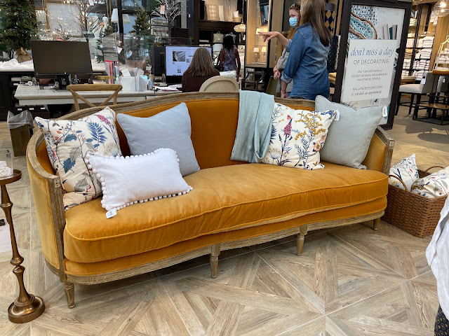
(If I was going to fall in love with a very expensive couch that is totally impractical for the way we live, then this ONE from Ballard would be IT!!!!! I saw it from across the showroom and it was love at first sight :)))  But doesn't that warm golden velvet just welcome you in? I think this color is so appealing!)

You can see that I'm drawn to this warm, mustardy yellow. I used this velvet ribbon at Christmas and it looked great with everything!


It's also the background color of my favorite tiger print pillow.


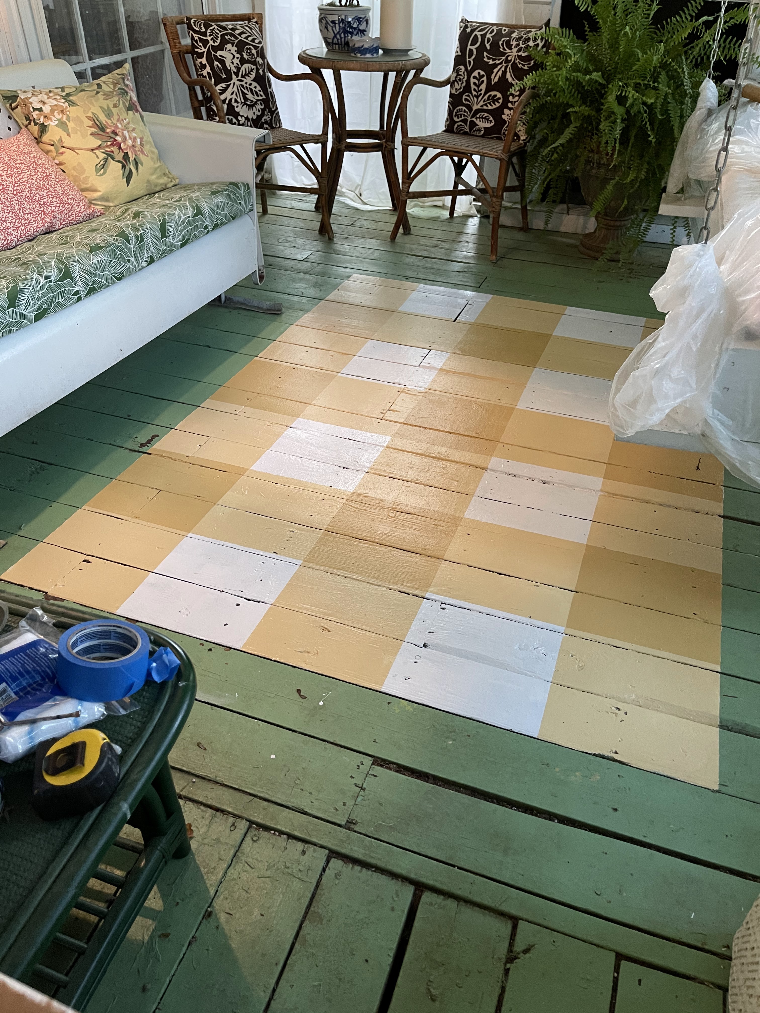
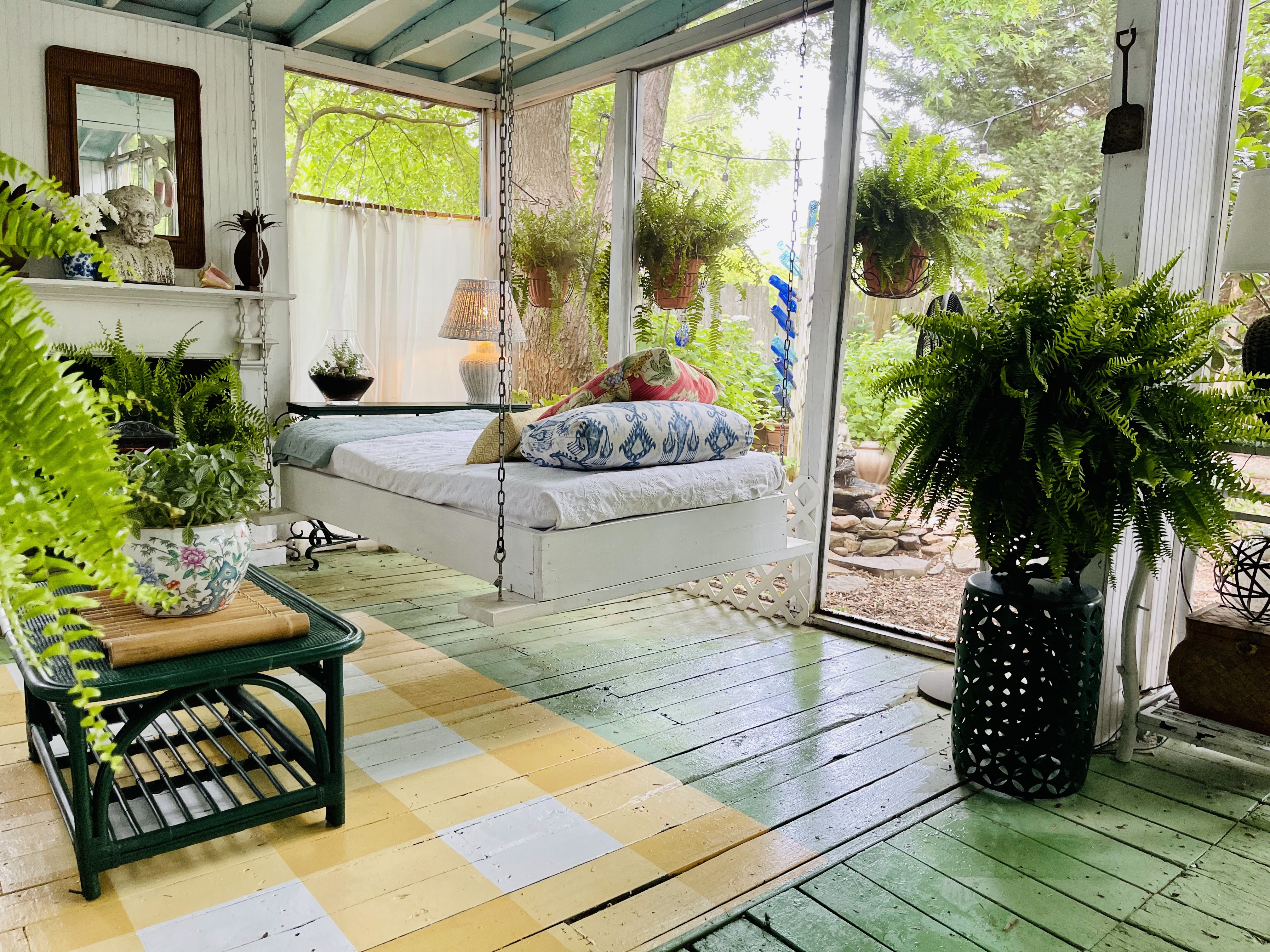
We have my favorite "yellow", a soft gold, from Sherwin Williams called Anjou Pear in our downstairs Powder Room and I used the same paint to paint a gingham rug on the screened porch. But If you aren't sure you are ready to commit to yellow in such a permanent  way then little touches will cheer things up too!


Try flowers or a bowl of lemons to add a dash of yellow. You can use the lemons so that's a bonus!


Or you can toss one golden yellow velvet pillow in a side chair.


I thrifted these yellow glazed jars and they look great filled with greenery and tucked in different spots around the house. Since they were thrifted it's not a big commitment or investment.


“There’s no doubt about it—yellow is a color that lifts one's spirits,” 
says designer Bunny Williams.

Go big or go small with yellow but add a touch to your home because who doesn't want to have their spirits lifted when they arrive home?

Be sure to read all the other Color Theory posts!
Feeling Green here.


Thursday, January 27, 2022

Feeling Green (Color Theory)

I have always been intrigued by the psychology of colors. Especially their impact on how they make us feel when they are used in our environment. I had quite a few college classes dealing with this - both when psychology was my minor, in art classes when I changed my major to textile design and then in a marketing/advertising focused class or two when I was a journalism major. Perhaps I should have taken a class on committing to a major. No need, my dad handled it by letting me know it was time to wrap things up as my life as a college student was coming to an end. Or at least the parental funding was!!

It all worked out but I still think about color psychology often, especially at the beginning of the year when paint companies and designers make their color trend forecasts or when I'm about to start a project at my home. So, I thought that perhaps this intrigues you as well and maybe we'd all like to know more about why we are drawn to certain colors. 

I could have gone in ROY G BIV or rainbow order but I keep seeing the statement "Green is having a moment this year" or people stating that they are really drawn to green lately. So I'm starting with green. I love green, I use it a lot and I think green as a color is great but an even better addition to a room is a green living element - plant, flowers, branches. 

Green is the color of nature. It is considered calming - it is actually shown to slow human metabolism and the result is a calming effect. Many feel that green reduces stress. So now that we know it's calming, reduces stress and connects us with the outside is it any wonder that we are seeing green everywhere right now?? If ever we needed these three benefits from a color it is NOW!

Over the past few months, four major paint brands announced that some type of green would be its color of the year for 2022. Behr went with a light sea-glass green called Breezeway; PPG Paints chose a neutral gray-green called Olive Sprig; Benjamin Moore picked a soft sage green called October Mist; and Glidden chose a creamy plant-inspired green called Guacamole. It’s no coincidence that the names and descriptions of all these shades hint at something natural or organic. According to environmental psychologist Sally Augustin, PhD, principal at Design With Science, this influx of green likely stems from our deep-rooted connection to nature and its supportive qualities. via wellandgood.com

These are some "green scenes" from my own home. I use a lot of green - painted and live. I almost think of green as a neutral in many of my spaces. 


Do you use green in your home? Are you thinking that it might be time to add some green to your spaces. Do you like plants? 

I love plants and I have a theory about having them in our homes. I hear people say that they don't have live plants in their rooms because they don't have a green thumb and they die. Well, when you buy a $10.00 floral bouquet at the grocery store you have zero expectations of it lasting more than a week. Even if you don't have much of a green thumb a $15 plant is going to last a month or two at least. And some of them might surprise you and do better than you think. I have a pretty green thumb but I do lose plants from time to time. And some do better than expected. They add so much to your space - take the risk!


This $8.00 Jasmine from Trader Joe's has doubled in size in 2 weeks and is about to burst into blooms. I just make sure it is not completely dried out and has good light. It has surprised me!
And the topiaries (first picture) on my green bamboo table on the porch? I call them "faux-piaries" because they are all fake - pretty good looking ones and they add a nice touch of green to a room. 

Here is a favorite green from Sherwin Wiliams: Talipot Palm . It's about to show up on a small project at my house.


And our porch floor is Lounge Green. I get asked all the time!

Not sure about the power of green paint. Look at this before and after!


Go green! That's my advice :)


Friday, May 14, 2021

The Painted Rug from #thethriftedporch

 I'm sure there are a lot of tutorials out there on the web for painting floors so I'm going to quickly share how I went about mine and what I used just in case you are thinking about giving it a try.


I used the same materials and process to paint my Powder Room floor last Summer. 

Your floor needs to be clean and if it has a glossy surface I recommend lightly sanding.  I mopped my porch floor to get off the pollen and dirt tracked in.

The first step is to tape off your rug shape or if it's the entire room just tape off your baseboards. Then you prime. I use oil based primer and I did two coats- possibly overkill but my Powder Room floor has shown no signs of wear and it's been 10 months of heavy traffic. 


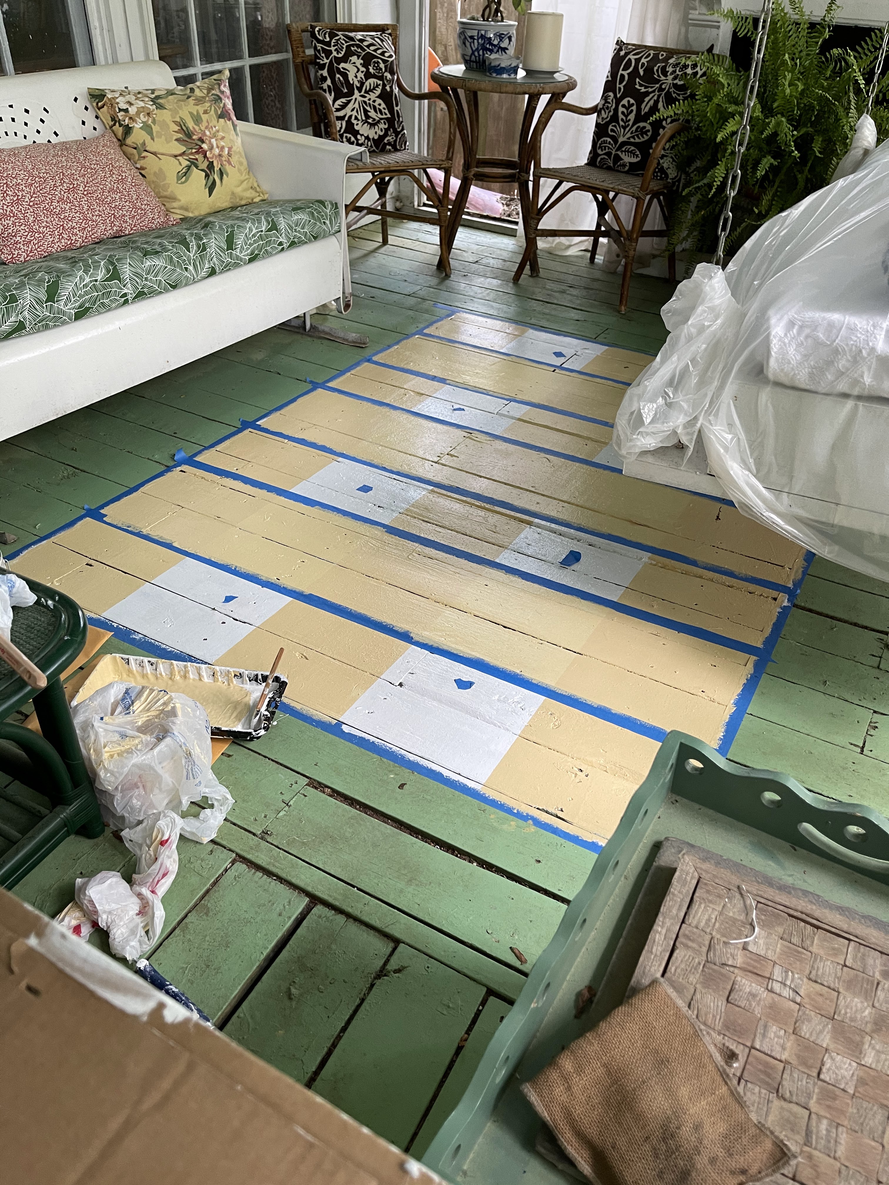
I let my primer dry overnight, painted the entire "rug" area white, let that dry and then I taped off the stripes lengthwise. I always put a tape dot in my "no paint" spaces while I'm in progress. It keeps me from making a mistake. You may not need it!


This is definitely a project where you want to measure twice before painting!! But if you make a mistake you can just paint over it and go again!!


I use Sherwin Williams Exterior Super paint on my floors. I've had great luck with it. #notsponsored
Because I was doing the checked pattern I mixed the Anjou Pear at about 1/3 AP to 2/3 white to get my lighter tone. Depending on your color choice you might have to adjust this ratio to make it work. 


Two coats of my lightened stripe color lengthwise. I let that dry overnight before taping off the horizontal stripes and giving them two coats of the same lightened AP.


After they all dried I taped off a "test" square where the stripes overlapped. I painted two coats of the full strength Anjou Pear to be sure the contrast was correct. I didn't want to do all the squares and then be unhappy when the tape came off!!


I liked it! It looked like gingham or buffalo check.
So I taped off the rest of the squares and painted them full strength AP.

Now for a confession. The furniture placement in this section is not perfectly balanced and the smaller rug I had in here before was off center so I knew the "rug" placement was a bit tricky. I debated forever about where I started it in relationship to the opening to the rest of the deck and the glider, etc. I should have gone with my first instinct because I ended up adding another 'row' of checks to that front edge after pulling all the tape up!!

Before the added row:


More measuring and taping to add the extra row of checks.

All of this taping and painting completely wore Cooper out!


 I think the proportion of the finished rug is better with the added row. I made the first outline 5 x 7 feet which is a traditional rug size. But that's the beauty of painting my own rug - I made it the size that "looks" right! 


It's a great, inexpensive way to brighten up a space! And it's just paint - if you want to change it then simply paint over it!