Showing posts with label screened porch. Show all posts

Tuesday, June 21, 2022

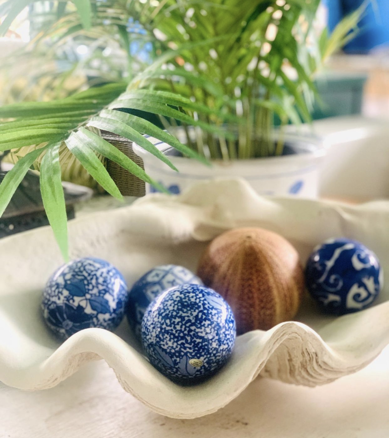
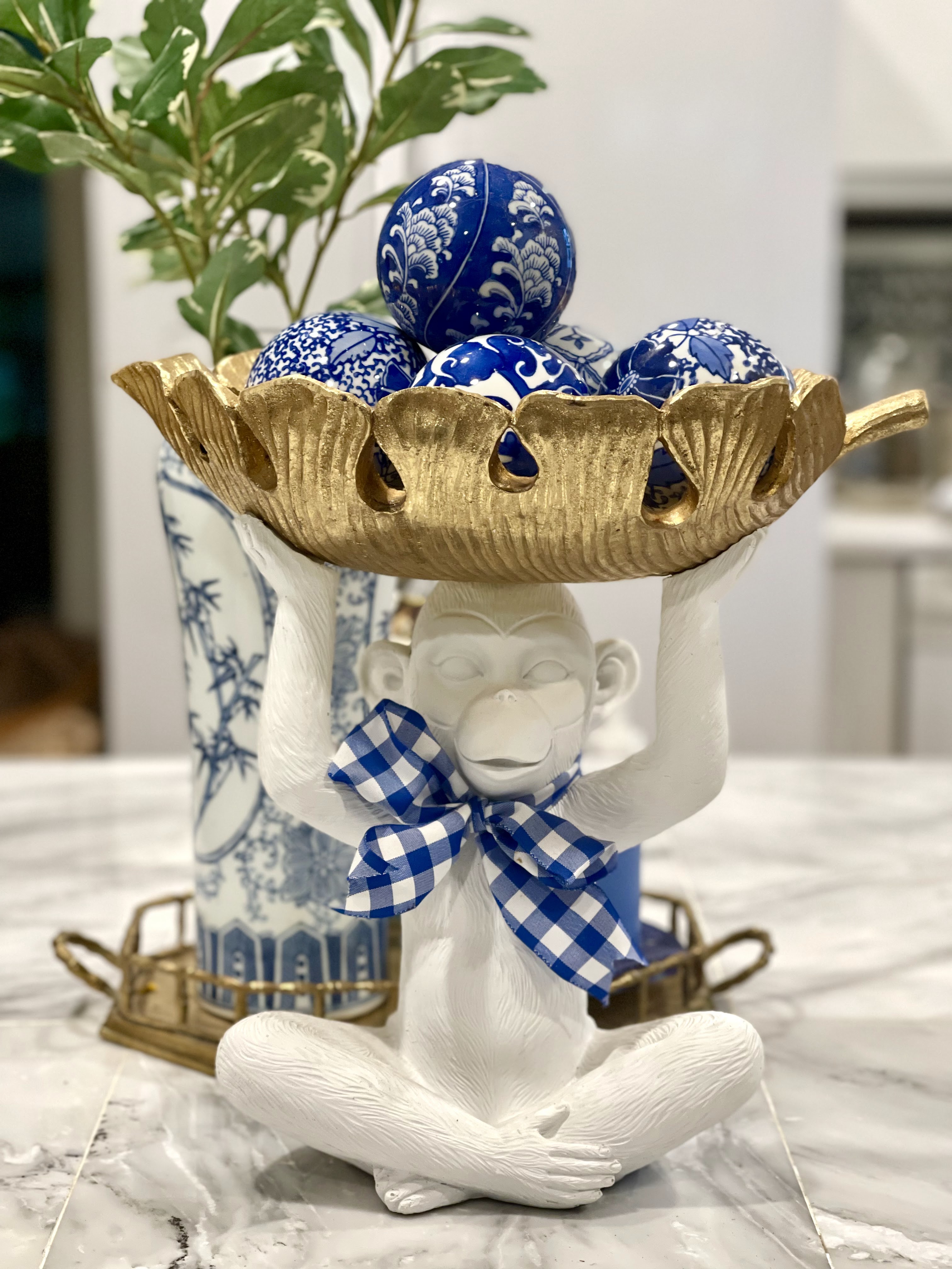
Chinoiserie Carpet Balls


Carpet Balls are pretty much just what they sound like - they were originally used for playing a bowling type game inside on carpet. The game originated in Scotland (according to most sources) in the 19th century.


 The game is played much like Bocci, Boules or British Lawn Bowling - just inside on carpet. The porcelain balls were originally painted with plaid, stripe or small flower designs in greens and reds. 


I'm not sure when the chinoiserie designs began appearing on them but all colors and designs of carpet balls have become very popular collectors items.


 They can range in price from a few dollars at a thrift store to hundreds for very old celadon glazed ones. 


I have found all of mine in thrift stores for just a few dollars each. 
I don't see them often but I grab them when I do. 


Be sure to check local vintage shops, eBay and Etsy as well.
 Check online auction/estate sale spots like Auction Ninja
I've seen them at estate sales in person and online.


If  you haven't had any luck thrifting some or finding any vintage ones 
new chinoiserie carpet balls are readily available as a decor accent. 
I'll link some below. 


These are slightly larger 4" carpet balls and come in a set of 3 from Amazon.


Wednesday, February 2, 2022

Hello Yellow! (Color Theory)

Yellow might be the most underused and underappreciated color in interior design. It is often considered the brightest and most energizing of the warm colors. It’s associated with happiness and sunshine. It can make a dark space more cheerful and it is the color associated  with hope and optimism. Sounds good to me!!


Light yellows also give a more calm feeling of happiness than bright yellows.


Dark yellows and gold-hued yellows can sometimes look antique and be used in rooms with a more traditional use or look. 

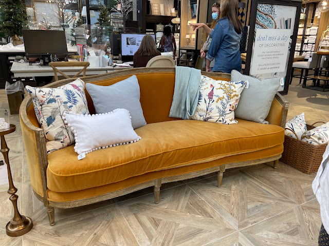
(If I was going to fall in love with a very expensive couch that is totally impractical for the way we live, then this ONE from Ballard would be IT!!!!! I saw it from across the showroom and it was love at first sight :)))  But doesn't that warm golden velvet just welcome you in? I think this color is so appealing!)

You can see that I'm drawn to this warm, mustardy yellow. I used this velvet ribbon at Christmas and it looked great with everything!


It's also the background color of my favorite tiger print pillow.


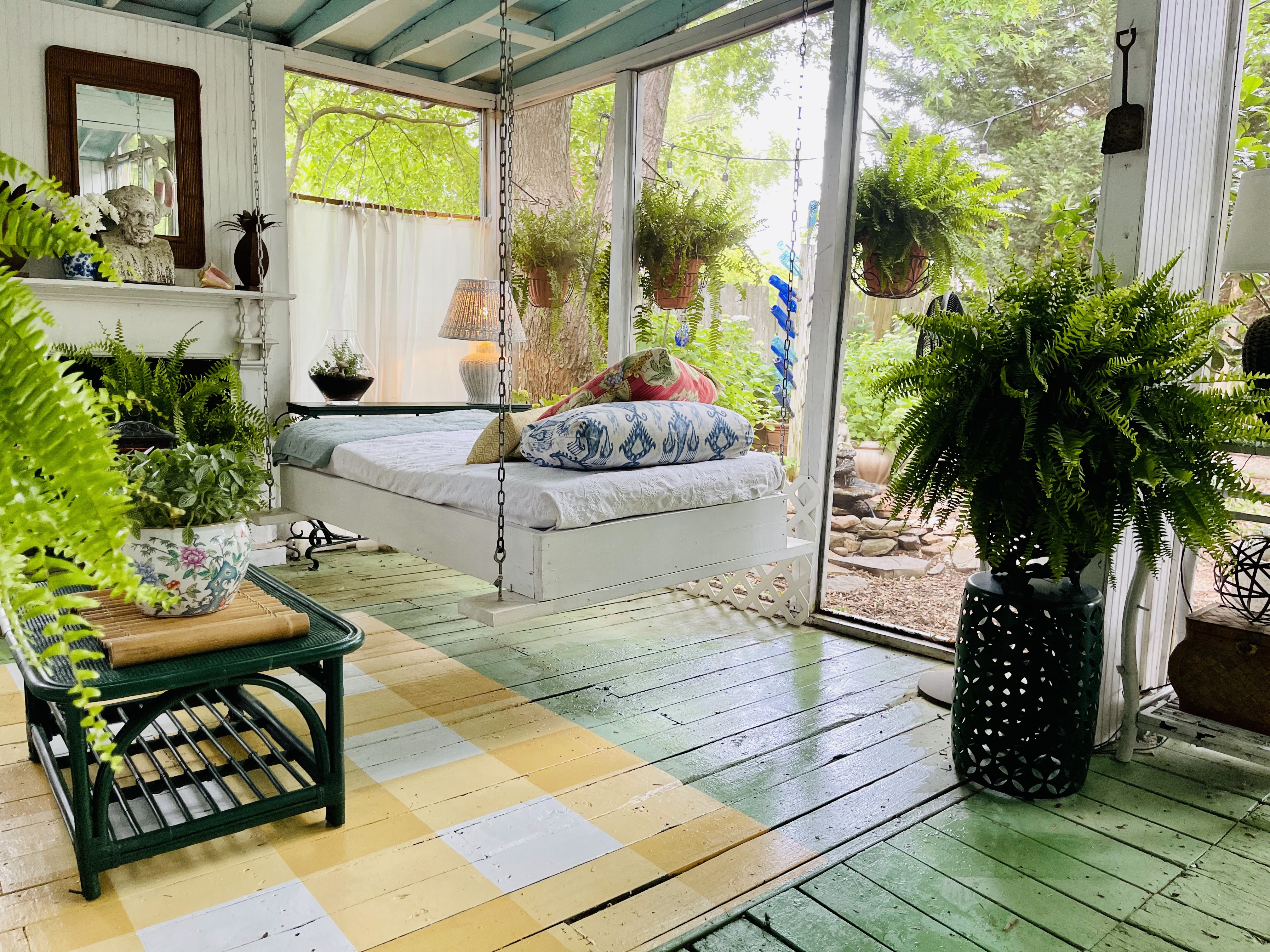
We have my favorite "yellow", a soft gold, from Sherwin Williams called Anjou Pear in our downstairs Powder Room and I used the same paint to paint a gingham rug on the screened porch. But If you aren't sure you are ready to commit to yellow in such a permanent  way then little touches will cheer things up too!


Try flowers or a bowl of lemons to add a dash of yellow. You can use the lemons so that's a bonus!


Or you can toss one golden yellow velvet pillow in a side chair.


I thrifted these yellow glazed jars and they look great filled with greenery and tucked in different spots around the house. Since they were thrifted it's not a big commitment or investment.


“There’s no doubt about it—yellow is a color that lifts one's spirits,” 
says designer Bunny Williams.

Go big or go small with yellow but add a touch to your home because who doesn't want to have their spirits lifted when they arrive home?

Be sure to read all the other Color Theory posts!
Feeling Green here.


Thursday, January 27, 2022

Feeling Green (Color Theory)

I have always been intrigued by the psychology of colors. Especially their impact on how they make us feel when they are used in our environment. I had quite a few college classes dealing with this - both when psychology was my minor, in art classes when I changed my major to textile design and then in a marketing/advertising focused class or two when I was a journalism major. Perhaps I should have taken a class on committing to a major. No need, my dad handled it by letting me know it was time to wrap things up as my life as a college student was coming to an end. Or at least the parental funding was!!

It all worked out but I still think about color psychology often, especially at the beginning of the year when paint companies and designers make their color trend forecasts or when I'm about to start a project at my home. So, I thought that perhaps this intrigues you as well and maybe we'd all like to know more about why we are drawn to certain colors. 

I could have gone in ROY G BIV or rainbow order but I keep seeing the statement "Green is having a moment this year" or people stating that they are really drawn to green lately. So I'm starting with green. I love green, I use it a lot and I think green as a color is great but an even better addition to a room is a green living element - plant, flowers, branches. 

Green is the color of nature. It is considered calming - it is actually shown to slow human metabolism and the result is a calming effect. Many feel that green reduces stress. So now that we know it's calming, reduces stress and connects us with the outside is it any wonder that we are seeing green everywhere right now?? If ever we needed these three benefits from a color it is NOW!

Over the past few months, four major paint brands announced that some type of green would be its color of the year for 2022. Behr went with a light sea-glass green called Breezeway; PPG Paints chose a neutral gray-green called Olive Sprig; Benjamin Moore picked a soft sage green called October Mist; and Glidden chose a creamy plant-inspired green called Guacamole. It’s no coincidence that the names and descriptions of all these shades hint at something natural or organic. According to environmental psychologist Sally Augustin, PhD, principal at Design With Science, this influx of green likely stems from our deep-rooted connection to nature and its supportive qualities. via wellandgood.com

These are some "green scenes" from my own home. I use a lot of green - painted and live. I almost think of green as a neutral in many of my spaces. 


Do you use green in your home? Are you thinking that it might be time to add some green to your spaces. Do you like plants? 

I love plants and I have a theory about having them in our homes. I hear people say that they don't have live plants in their rooms because they don't have a green thumb and they die. Well, when you buy a $10.00 floral bouquet at the grocery store you have zero expectations of it lasting more than a week. Even if you don't have much of a green thumb a $15 plant is going to last a month or two at least. And some of them might surprise you and do better than you think. I have a pretty green thumb but I do lose plants from time to time. And some do better than expected. They add so much to your space - take the risk!


This $8.00 Jasmine from Trader Joe's has doubled in size in 2 weeks and is about to burst into blooms. I just make sure it is not completely dried out and has good light. It has surprised me!
And the topiaries (first picture) on my green bamboo table on the porch? I call them "faux-piaries" because they are all fake - pretty good looking ones and they add a nice touch of green to a room. 

Here is a favorite green from Sherwin Wiliams: Talipot Palm . It's about to show up on a small project at my house.


And our porch floor is Lounge Green. I get asked all the time!

Not sure about the power of green paint. Look at this before and after!


Go green! That's my advice :)


Thursday, August 5, 2021

Lamp Magic

 Lamp Magic - not Magic Lamps (like the kind with a Genie inside!) Lamps can add such an important touch to a room but they can be pricey. There are so many choices and styles plus add in decorative or colored lamp shades and the possibilities (and decisions) can be endless.  

But just like every other item in my home, I like to see if I can find an affordable and, hopefully, thrifted choice*. But sometimes those lamps just need help. 

Never underestimate the power of glossy white paint when it comes to lamp dilemmas. These are just a couple of examples of "lamp rescues" that I've done. 


This rather regal looking camel lamp is one of my favorite white paint "transformations."
Here is his before. Brown lamps with gold brushed accents just don't work for my style so I paint my lamps - if the before is more your style, please don't be offended!! 


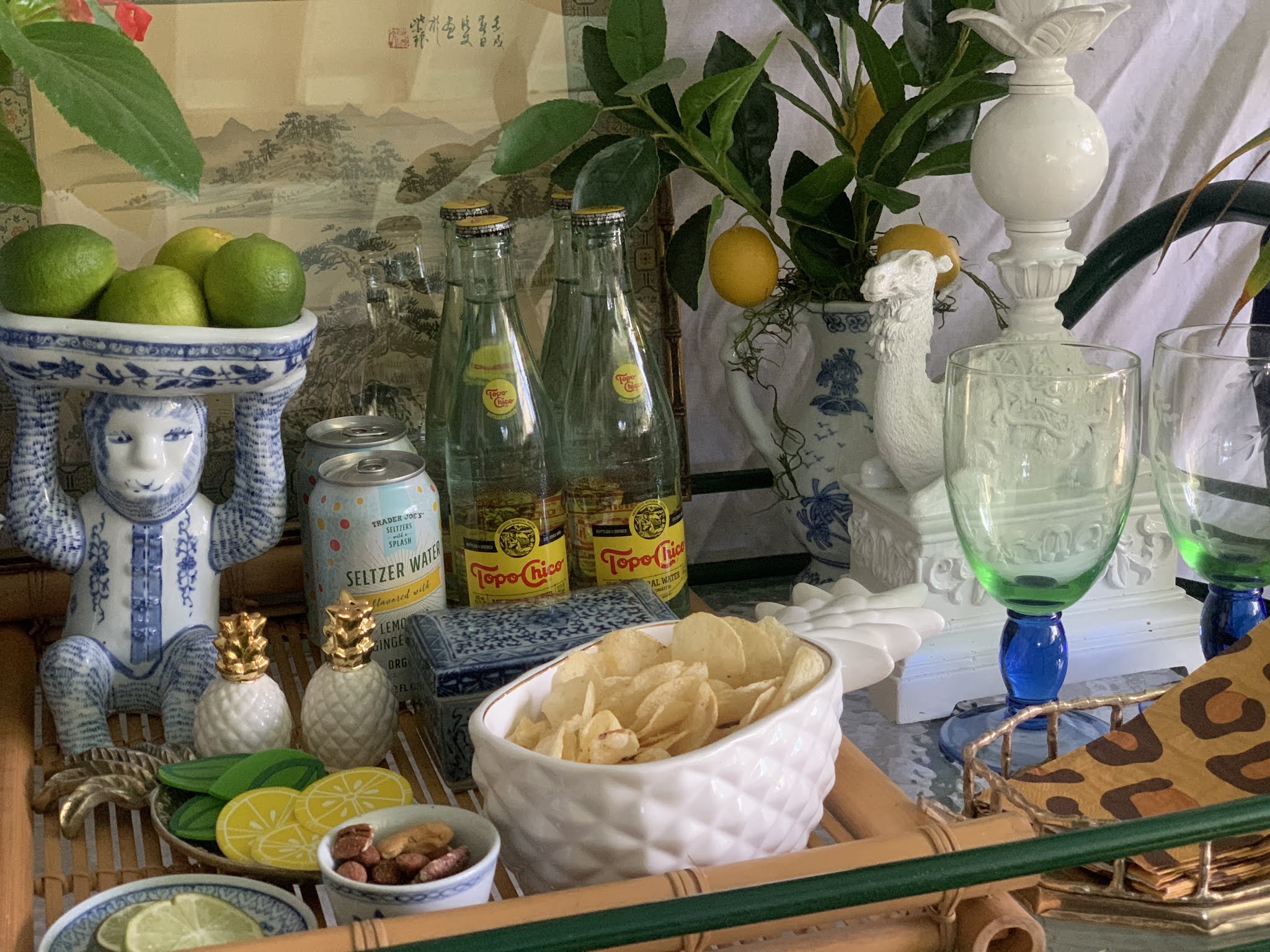
He happily lives on my screened porch bar cart - I just taped off the parts that shouldn't get paint on or in them and spray painted using my favorite spray paint. I know there are environmental issues with spray paints as well but a little spray painting keeps this lamp and all of it's electrical parts out of a landfill so I still consider it a plus. 


Last Summer I refreshed our main level powder room as part of the One Room Challenge and used a fun monkey lamp I'd been saving for just the right spot.


And the before:


I have a very difficult time leaving behind an elephant lamp when I go thrifting.
 I have a couple tucked here and there.
Just before my #thethriftedporch reveal I looked over and noticed this elephant lamp was still brown (it also still had the GW price sticker on it - welcome to my world!)


Freshened up with a coat of white spray paint and a thrifted white wicker lampshade. So much fresher and perfect on the porch. I think the white lamp shows up better and the details are more noticeable in the lighter color.


Not a great picture but he didn't look too 'great' when I found him.
Glossy white paint and a thrifted wicker shade made all the difference. 
Sorry for the holiday picture but that's probably when my kitchen was clean and photo ready! :)
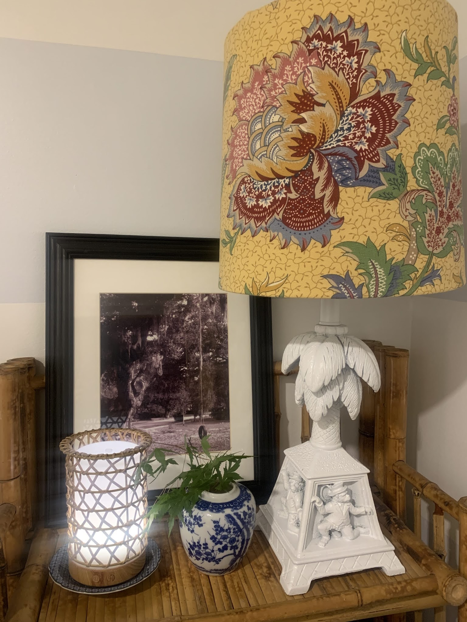

I often use thrifted wicker and rattan lampshades on my lamps that I spray glossy white because I think the warmth and texture is a nice counterpoint to the lamps but refreshed, thrifted lamps are the PERFECT place to use one of my Faux DIY Pleated Lampshades. 


*Always check your thrifted lamp wiring for any safety issues. It is very easy to rewire most older lamps using rewiring kits. If you don't think you want to attempt rewiring yourself then it is not too expensive to have a lamp rewired at a local lamp shop. Even with the expense of rewiring, most thrifted lamps will still be far more affordable than a new purchase. Plus they often have a lot of character and it is environmentally sound as well to reuse a lamp that would be thrown out.
You just have to read the specs and choose the size that best fits your needs. And there are a ton of help videos on the internet if seeing helps you more than reading directions!

Friday, May 14, 2021

The Painted Rug from #thethriftedporch

 I'm sure there are a lot of tutorials out there on the web for painting floors so I'm going to quickly share how I went about mine and what I used just in case you are thinking about giving it a try.


I used the same materials and process to paint my Powder Room floor last Summer. 

Your floor needs to be clean and if it has a glossy surface I recommend lightly sanding.  I mopped my porch floor to get off the pollen and dirt tracked in.

The first step is to tape off your rug shape or if it's the entire room just tape off your baseboards. Then you prime. I use oil based primer and I did two coats- possibly overkill but my Powder Room floor has shown no signs of wear and it's been 10 months of heavy traffic. 


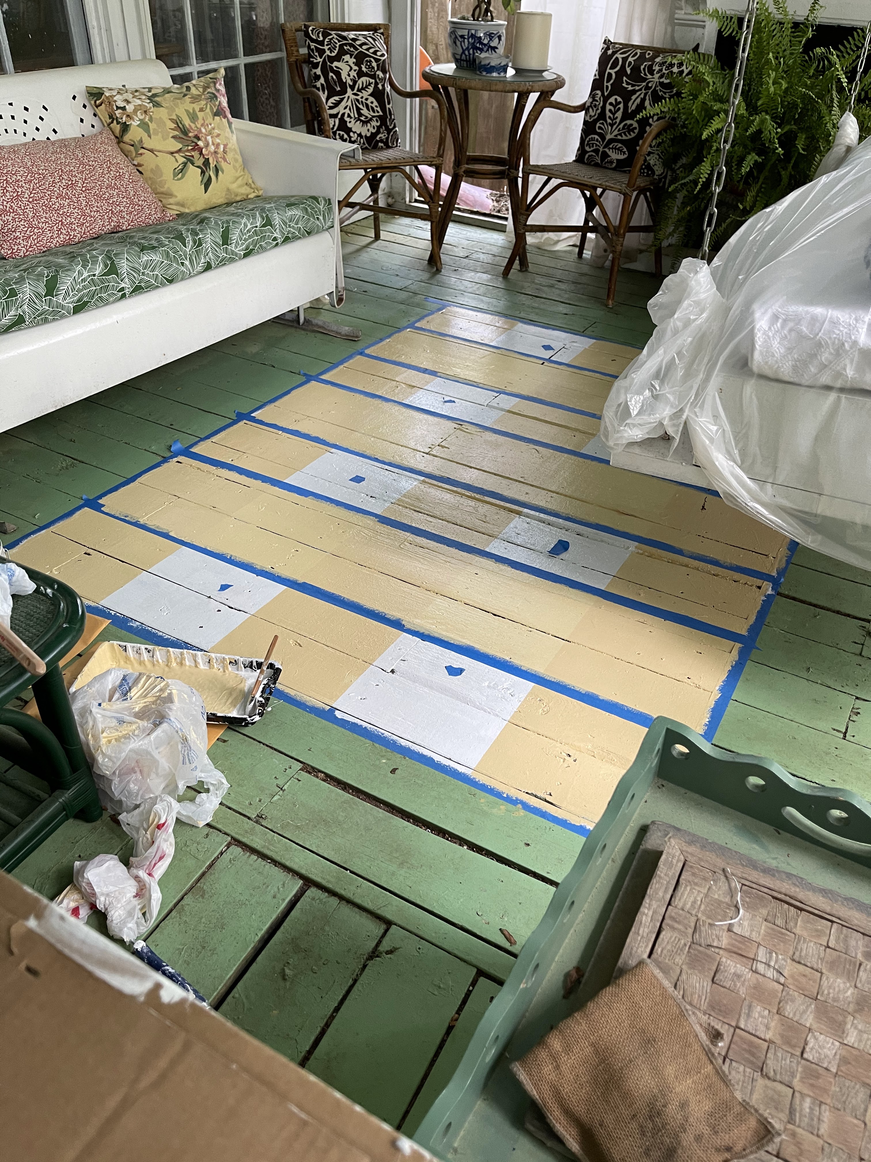
I let my primer dry overnight, painted the entire "rug" area white, let that dry and then I taped off the stripes lengthwise. I always put a tape dot in my "no paint" spaces while I'm in progress. It keeps me from making a mistake. You may not need it!


This is definitely a project where you want to measure twice before painting!! But if you make a mistake you can just paint over it and go again!!


I use Sherwin Williams Exterior Super paint on my floors. I've had great luck with it. #notsponsored
Because I was doing the checked pattern I mixed the Anjou Pear at about 1/3 AP to 2/3 white to get my lighter tone. Depending on your color choice you might have to adjust this ratio to make it work. 


Two coats of my lightened stripe color lengthwise. I let that dry overnight before taping off the horizontal stripes and giving them two coats of the same lightened AP.


After they all dried I taped off a "test" square where the stripes overlapped. I painted two coats of the full strength Anjou Pear to be sure the contrast was correct. I didn't want to do all the squares and then be unhappy when the tape came off!!


I liked it! It looked like gingham or buffalo check.
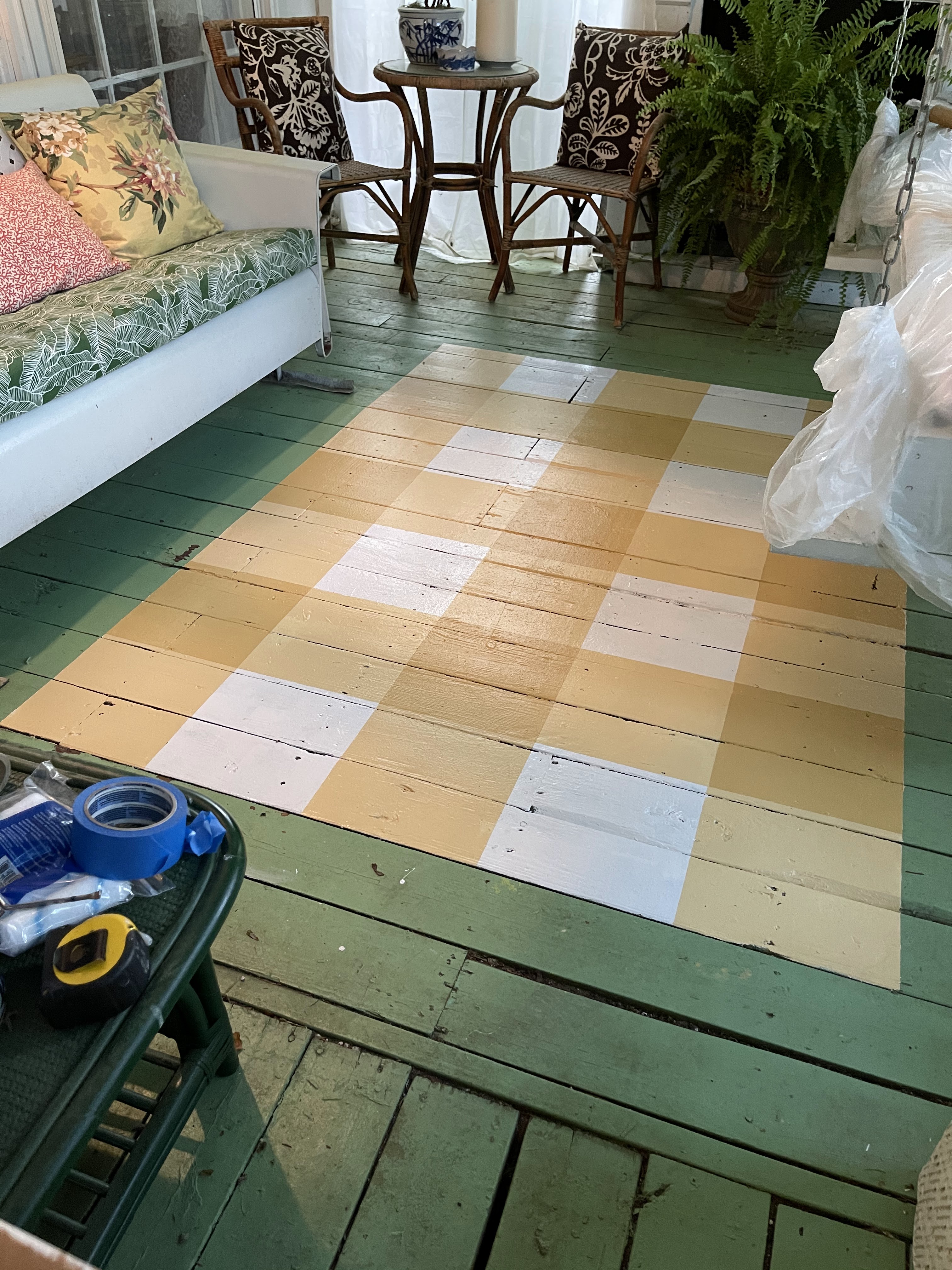
So I taped off the rest of the squares and painted them full strength AP.

Now for a confession. The furniture placement in this section is not perfectly balanced and the smaller rug I had in here before was off center so I knew the "rug" placement was a bit tricky. I debated forever about where I started it in relationship to the opening to the rest of the deck and the glider, etc. I should have gone with my first instinct because I ended up adding another 'row' of checks to that front edge after pulling all the tape up!!

Before the added row:


More measuring and taping to add the extra row of checks.

All of this taping and painting completely wore Cooper out!


 I think the proportion of the finished rug is better with the added row. I made the first outline 5 x 7 feet which is a traditional rug size. But that's the beauty of painting my own rug - I made it the size that "looks" right! 


It's a great, inexpensive way to brighten up a space! And it's just paint - if you want to change it then simply paint over it!