Showing posts with label color theory. Show all posts

Wednesday, January 31, 2024

Chartreuse is Having a Moment

From the runways to the bedroom, we will be seeing this zesty green hue everywhere in 2024. "Chartreuse is a bold, energizing color..."  - House Beautiful

I couldn't resist this beautiful plant the other day because of its amazing chartreuse color. I started thinking about the color and how much I'm currently noticing it in beautifully designed rooms.

What do you think? I personally love chartreuse as an accent color. I think it makes other colors seem more crisp and vibrant.  The color was named after a French liqueur called “chartreuse” which has a greenish-yellow hue. The liqueur was first produced in 1605 by the Carthusian monks of France. So while chartreuse is having a "moment" it has been around a long time and gone in and out a favor in design many times. 

I agree it is a bold choice but just a touch can really give a room some pep. I think it works just as well in winter as it does during the spring and summer.


I have a large chartreuse velvet pillow on our garden room daybed. One of the things I like best about chartreuse? It plays well with Le Tigre - actually with all animal prints!

Pillow covers or a throw blanket tossed on your couch is an easy and inexpensive way to add the zing of chartreuse to your room.

I already have a velvet throw that I love to add to the end of a couch or use on the daybed but this throw is really tempting me.  Such an easy way to add a touch of chartreuse and everyone loves a cozy throw blanket. 

If you are thinking about adding a touch of chartreuse with throw pillows I think lumbar pillows can be a great way to go. You simply add them in front of throw pillows you already have and use. A pair of lumbar pillow covers for under $15.00 is a great way to try a new color and see how you like it. 
A quick, easy and inexpensive way to add a touch of chartreuse to any space would be to spray paint something. This is my favorite chartreuse spray paint! It could be something you find at the thrift store or something you already have - a candlestick, wooden tray, a lamp base or a basket to toss magazines or tv remotes into. . 


Check out these fun lamps. They are available online but you could definitely get this look with thrifted lamps and a can of spray paint!


Another one of my decor favorites that looks great with chartreuse is blue and white chinoiserie! A very "safe" way to give the bold chartreuse a try is to use some taper candles on the dinner table set with your blue and white dishes!


What do you think? Are you ready to give chartreuse a try? 


Sunday, March 6, 2022

When The Blues Are A Good Thing (Color Theory)

Feeling blue, having the blues, are sayings associated with people's moods but having blue around in interior design is actually a very good thing.

Blue rooms have  been shown to lower blood pressure and heart rate, and although it opposes the “feeling blue” idiom, living in a blue room has been proven in multiple studies to help people with depression. It’s almost impossible to be stressed out in a blue room! Blue helps us sleep too. We love blue and white together, but blue also pairs excellently with bright colors that are sometimes difficult to work with (like green, orange, or fuchsia) and with several materials, like wood and metallics. via Kathy Kuo Home

Blue is also America's favorite color. More people claim blue as their favorite color than any other. Almost 50% of men say it's their favorite and 35% of women choose blue as their favorite color. It is the most prominent color used in marketing and social media platforms - now you know why. Everybody loves blue!


(You can introduce blue into a room through art. Seascapes are an easy way to do this but this leopard print from @urbangardenprints is a unique way to so this. And cyanotypes like the one below are another unique type of blue artwork.)

There are a lot of interior designers (think Mark D. Sikes or Ralph Lauren) and design bloggers known for using a lot of blue in their projects. If you aren't a professional blue is always a great color to build a room design around. There are a lot of scientific reasons (having to do with light, perception, etc.) why blue is so easy on the eye and compliments most color schemes but the bottom line is that for most of us it is easier use in a room design than other colors. It's a great color to start with and build design confidence along the way. 


You don't have to paint the walls blue if you aren't feeling that confident. This blue leopard print chair is a great addition to my fairly neutral Family Room and picks up the blue from the blue and white chinoiserie pieces dotted around the room. Or just add a cozy, soft blue throw to a couch to introduce a larger amount of blue to your space. 
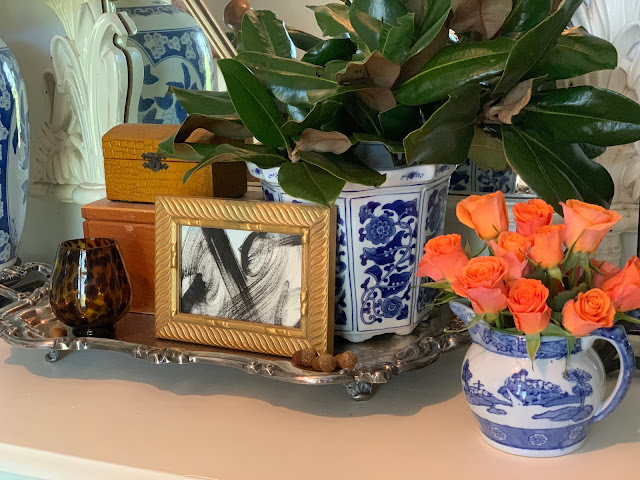

Obviously, I think adding blue and white chinoiserie pieces like lamps and planters or blue and white pillows is the quickest and easiest way to add blue to a space. 


My library mantel is filled with blue and white pieces and I've introduced a softer blue into the room through my vintage globe collection. If you have blue accents in a room your eye will travel around to them and you'll have a relaxing response to all of the blue.


I used blue and white checks to recover the seat cushions on our bamboo porch furniture. This is a classic way to add summery blue to your outside spaces. And blue hydrangeas are such a fun way to have blue inside and out during the summer. 


And a little blue paint on an accent piece can be a very bold way to add some blue to your space. 
This wicker bench was looking dingy and worn...


And after 15 minutes and some blue spray paint!


So fresh and much more exciting.


Even my pumpkins are blue and white!!


Oh, and my Easter eggs are blue and white, too :))


So, I guess I can say I've always got a touch of the blues...
What about you?


Catch up with the rest of the "color theory" series (so far!) here:
Green
And don't miss the Color Theory Reels on IG:

Friday, February 18, 2022

Orange You Glad It's Time? (Color Theory)

Orange is a fun but strong and energetic color. Interestingly enough, people feel strongly about using it (or not) in home decor.  Orange increases energy and boosts creativity so maybe we should be more open to it!

An inherently happy and uplifting color, orange is a hue that should be used more often in home decor. A shade that can be both contemporary and rustic, orange has a reputation for being a difficult color to decorate with, but that doesn't have to be the case. via TheSpruce.com

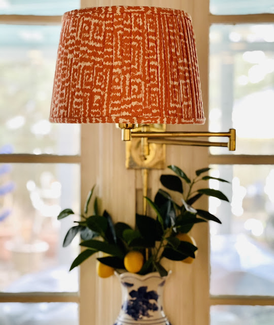
This chinoiserie lamp has a fun, bright orange background and it adds a pop of color to our garden room. 

I have another fabulous chinoiserie lamp in orange that is in our upstairs bathroom. I found this one in a thrift shop and love the touch of color it brings to the room. I've never found another orange and white one while out vintage shopping.


And long before the zebra rug made an appearance in our library there was a bright orange rug in there! You can see a little bit of it in the (poor quality) shot below.

But truth be told, at our house, the "orange" items tend to skew coral which is one of my favorite colors of all time. It's warm and easy to use with every other color. Not pink and not orange, coral is a blend of both and that makes it a win in my book.


I painted this faux bamboo cabinet a gorgeous, glossy coral. Our main bathroom is closet-less so I found this china cabinet to use as creative storage. It's amazing how much this bold color changed the cabinet! This was the listing picture in the thrifting app.


I have a second faux bamboo piece painted in the same cheery coral. This one is in our kitchen and you can see I even use coral-y orange plaid bows in here at Christmas time. The curtains in the kitchen are a coral and orange leopard print. 


I used a coral-y orange fabric to create this faux pleated lampshade for our kitchen. The directions are here and it was even featured on Apartment Therapy (which was a thrill for me!) 


The orange color is nice during the day but it absolutely glows at night when the lamp is on. 


Not ready to fully commit to orange or even coral? I have a coral throw and a couple of shades of orange-y coral pillows that I add to the family room couch to cozy things up in the winter. They pick up the color in the shells in the cabinet behind them which is a bonus.


My monkey often holds a pile of oranges - real fruit is a great way to add color (and you can snack on it, too!) and I often buy orange and bright coral roses because they add such a fresh spot of color. They are a great addition during the winter. 


I have this great piece of Jane Shelton faux bois fabric in a coral and orange stripe. I'm not sure where I am going to use it but I love the colors and anything faux bois so I had to grab a few yards for future use.


I have used orange pillows on my porch from time to time. Orange looks great with all the blue on my porch because they are complementary colors on the color wheel. 


Last Summer we used coral and orange accents to accessorize our trough pool that we fondly call "the Bucket."


I found this great orange paisley on a soft blue background when I was fabric shopping last week. Pillows in this fun print would be fabulous on a Summer porch! It was such a beautiful combination of bright orange and soft blue, cool and warm colors and that large swirling paisley to top it all off. I love a good paisley!


Orange can be a great addition to your spaces - even if it's just a few flowers, some fruit or a pillow. The warmth and vibrancy adds a little something extra to a room and is much easier to incorporate than it initially seems. Orange is associated with success and confidence. And bravery. Be brave and try a touch (or more) of orange in your decor!


Wednesday, February 2, 2022

Hello Yellow! (Color Theory)

Yellow might be the most underused and underappreciated color in interior design. It is often considered the brightest and most energizing of the warm colors. It’s associated with happiness and sunshine. It can make a dark space more cheerful and it is the color associated  with hope and optimism. Sounds good to me!!


Light yellows also give a more calm feeling of happiness than bright yellows.


Dark yellows and gold-hued yellows can sometimes look antique and be used in rooms with a more traditional use or look. 

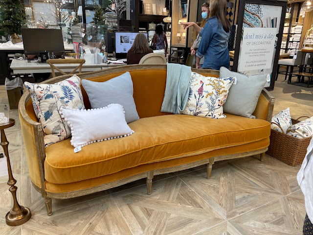
(If I was going to fall in love with a very expensive couch that is totally impractical for the way we live, then this ONE from Ballard would be IT!!!!! I saw it from across the showroom and it was love at first sight :)))  But doesn't that warm golden velvet just welcome you in? I think this color is so appealing!)

You can see that I'm drawn to this warm, mustardy yellow. I used this velvet ribbon at Christmas and it looked great with everything!


It's also the background color of my favorite tiger print pillow.


We have my favorite "yellow", a soft gold, from Sherwin Williams called Anjou Pear in our downstairs Powder Room and I used the same paint to paint a gingham rug on the screened porch. But If you aren't sure you are ready to commit to yellow in such a permanent  way then little touches will cheer things up too!


Try flowers or a bowl of lemons to add a dash of yellow. You can use the lemons so that's a bonus!


Or you can toss one golden yellow velvet pillow in a side chair.


I thrifted these yellow glazed jars and they look great filled with greenery and tucked in different spots around the house. Since they were thrifted it's not a big commitment or investment.


“There’s no doubt about it—yellow is a color that lifts one's spirits,” 
says designer Bunny Williams.

Go big or go small with yellow but add a touch to your home because who doesn't want to have their spirits lifted when they arrive home?

Be sure to read all the other Color Theory posts!
Feeling Green here.